BlogsGuide
Why Your Event Page Isn't Converting (and How to Fix It)
Most event pages convert at just 5%. Discover the psychology of attendee doubt, why "free" isn't enough, and how to build high-converting event experiences.
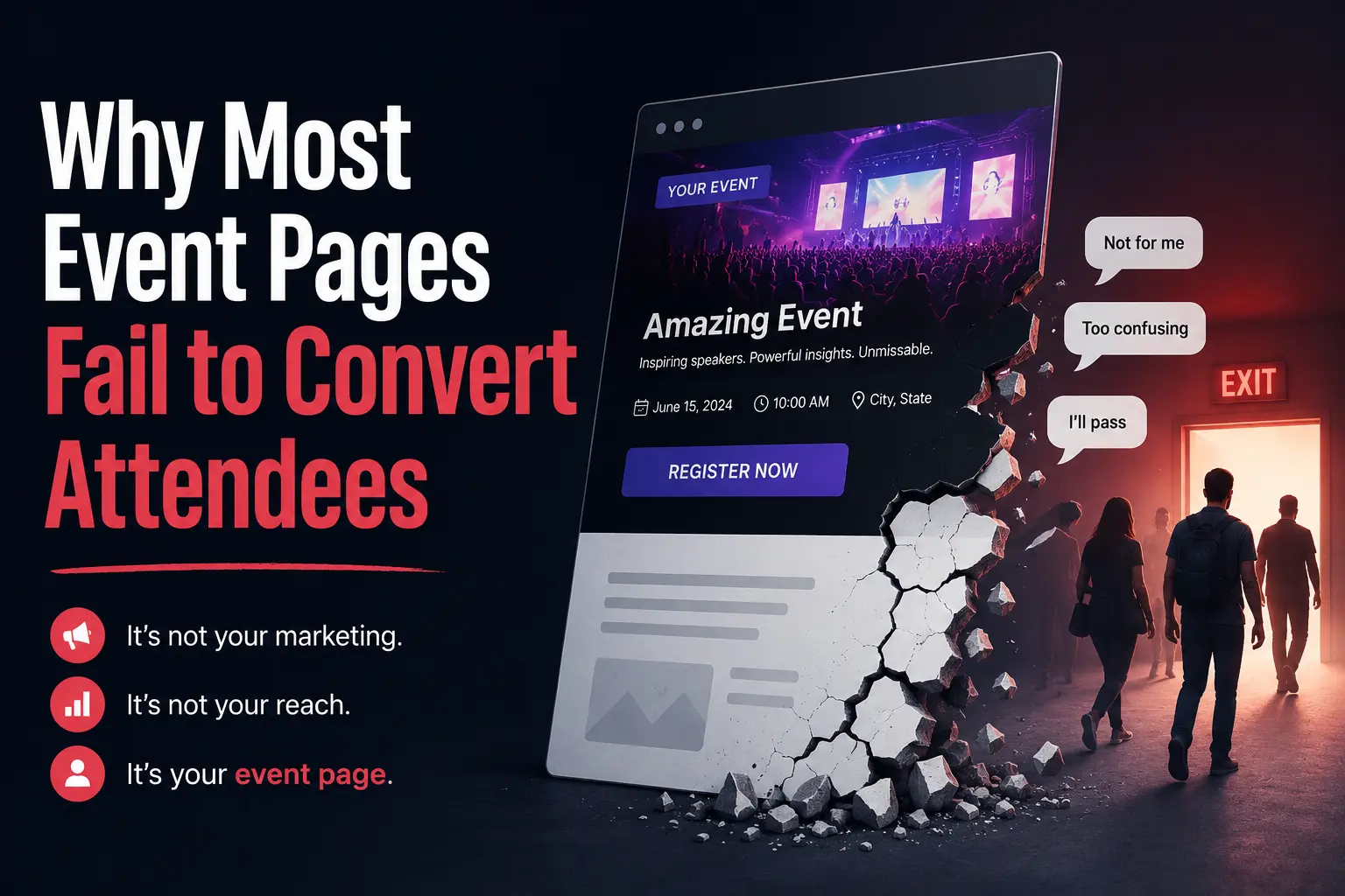
Most event organizers think attendance problems start with marketing.
They blame ads.
They blame algorithms.
They blame low reach.
But in many cases, the real problem starts after someone clicks.
The event page itself fails.
A visitor lands on the page interested, curious, maybe even excited — and leaves without registering.
Not because the event is bad.
But because the page creates friction instead of momentum.
This is one of the biggest hidden problems in modern event marketing.
Organizers spend thousands driving traffic from Instagram, WhatsApp communities, LinkedIn posts, email campaigns, creator collaborations, and paid ads.
Yet the final experience — the event page — often feels outdated, cluttered, generic, or confusing.
And conversion dies there.
For modern communities, creator-led experiences, workshops, meetups, conferences, and social events, the event page is no longer just an information page.
It is the product experience before the event begins.
The Real Job of an Event Page
Most platforms still treat event pages like digital posters.
Title.
Date.
Location.
Description.
Button.
Done.
But attendee behavior has changed.
People don’t register instantly anymore.
They evaluate:
Is this event worth my time?
Who else is attending?
Does this feel trustworthy?
Is the experience premium?
Is this relevant to me?
What exactly will happen there?
Does this match my identity or interests?
Your event page has to answer all of those questions in seconds.
A high-converting event page reduces uncertainty.
A bad event page increases it.
That difference directly impacts registrations.
Why Most Event Pages Fail
1. They Look Generic
One of the biggest conversion killers is sameness.
Most event pages today look almost identical.
The same layouts.
The same templates.
The same structure.
The same boring blocks of text.
Modern attendees are highly visual.
If your page looks like every other event page online, it instantly feels forgettable.
Especially for creator-led events, niche communities, startup gatherings, workshops, social clubs, university events, and modern cultural experiences — branding matters.
People associate presentation quality with event quality.
A premium event with a low-effort page creates distrust.
2. Too Much Information, No Storytelling
Many event pages overload visitors with information.
Long paragraphs.
Huge agendas.
Walls of text.
Random sections.
But attendees rarely read event pages line-by-line.
They scan.
The best event pages feel like landing pages — not documents.
They guide attention.
They build excitement.
They create momentum.
Good event storytelling answers:
Why should I care?
What makes this special?
What will I experience?
Who is this for?
What outcome will I get?
Most pages skip emotional positioning completely.
And emotion is what drives registrations.
3. Weak Mobile Experience
A massive percentage of event traffic now comes from mobile.
Especially from:
Instagram stories
WhatsApp shares
Telegram groups
LinkedIn mobile
Creator communities
QR scans
Yet many event pages are still desktop-first.
Buttons are hard to tap.
Text feels crowded.
Sections break.
Load times are slow.
Forms feel painful.
Every extra second or extra click reduces conversion.
Modern event pages must feel native to mobile behavior.
Fast.
Simple.
Smooth.
Clear.
4. Registration Feels Like Work
This is where many conversions die.
Users click “Register” and suddenly face:
Long forms
Forced account creation
Confusing ticket flows
Too many fields
Redirect chaos
Poor payment UX
Every unnecessary step creates drop-off.
The best conversion systems remove friction instead of adding process.
Modern attendees expect consumer-grade experiences.
If buying coffee online feels smoother than registering for your event, your funnel has a problem.
5. No Social Proof
People trust people.
Yet many event pages fail to communicate:
Past event experiences
Community size
Testimonials
Speaker credibility
Attendee energy
Photos or moments
Brand trust
Without social proof, attendees hesitate.
Especially for newer organizers.
Even simple signals can dramatically improve conversion:
“500+ attendees joined last edition”
Community highlights
Real attendee photos
Creator collaborations
Partner logos
User testimonials
A registration decision is often emotional validation.
People want confidence that others already trust the experience.
6. The Page Isn’t Built for Modern Communities
Traditional event systems were designed for ticketing.
Modern events are different.
Today’s experiences are community-driven.
People want:
Multi-day experiences
Creator-hosted spaces
Recommendations
Activity sections
Personalized schedules
Interactive content
Community discovery
Flexible page structures
But most platforms still lock organizers into rigid templates.
That creates a mismatch between the experience being promised and the experience being presented.
The result?
Lower trust.
Lower excitement.
Lower conversion.
What High-Converting Event Pages Actually Do Differently
The best event pages don’t just provide information.
They create anticipation.
They Build Emotional Momentum
Great event pages make people imagine themselves there.
The visuals.
The atmosphere.
The people.
The outcomes.
They don’t just say:
“Join our networking event.”
They communicate:
“Meet ambitious people who actually share your interests.”
That difference matters.
They Prioritize Clarity
Visitors should immediately understand:
What the event is
Who it’s for
Why it matters
When and where it happens
What action to take next
Confused visitors do not convert.
They Feel Designed, Not Generated
Design quality influences perceived trust.
The strongest event pages feel intentional.
Not copied.
Not templated.
Not generic.
Modern organizers increasingly want event pages that reflect their brand identity, community culture, and audience expectations.
Because events today are extensions of brands.
They Reduce Friction Everywhere
High-converting pages simplify every step.
Faster loading
Cleaner layouts
Better mobile UX
Smarter forms
Clear CTAs
Seamless registration
Better navigation
Good conversion is usually the result of removing obstacles.
The Shift Happening in Event Platforms
The event industry is quietly changing.
Organizers no longer want “just a ticketing page.”
They want:
Flexible experiences
Better branding
Community-driven flows
Creator-first design
Multi-section storytelling
Personalized event journeys
More ownership over attendee experience
This is especially true for:
Creator events
Startup communities
Modern conferences
Social clubs
University communities
Local experiences
Workshops
Networking events
Curated gatherings
The future of event platforms is not just logistics.
It’s experience design.
Why This Matters More Than Ever
Attention is becoming more expensive.
Every click costs more.
Every impression matters more.
Every attendee decision happens faster.
Which means your event page cannot be an afterthought anymore.
If your event page converts poorly, your marketing spend becomes inefficient.
Even great events struggle when the digital experience feels weak.
And in a world where creators, communities, and independent organizers are competing for attention daily, experience quality becomes a competitive advantage.
The Future of Event Pages
The next generation of event pages will look very different from traditional event platforms.
They’ll be:
More immersive
More customizable
More community-centric
More mobile-native
More visual
More interactive
More creator-focused
Instead of rigid templates, organizers will build experiences.
Instead of static pages, events will feel alive before they even begin.
That shift is already starting.
And the organizers who adapt early will convert better, build stronger communities, and create more memorable experiences.
Final Thoughts
Most event pages fail because they were designed for information.
Modern attendees expect experiences.
The difference between a low-converting page and a high-converting one is rarely just traffic.
It’s how the experience feels.
The strongest event pages create clarity, excitement, trust, and momentum.
They reduce friction.
They reflect identity.
They help attendees emotionally commit before the event even starts.
Because today, the event experience begins long before people arrive.
It begins the moment they land on your page.
About Occyra
Occyra is building a more modern approach to event experiences — helping organizers, creators, and communities create flexible, branded, experience-first event pages instead of relying on outdated one-size-fits-all templates.
From multi-section event experiences to community-focused flows, the goal is simple:
Help events feel memorable before they even happen.
Ready to build your event page?
Create your event on Occyra